May 21, 2026 · ASCII Art
How to Make ASCII Art From a Photo for a GitHub README
A good README does the same job as a landing page — it tells a visitor what the project is in the first few seconds. Some of the most memorable ones open with a chunk of ASCII art — a banner spelling the project name, a tiny portrait of the maintainer, a mascot. It loads instantly, never breaks when an image host goes down, and it shows up identically in a terminal, a screen-reader, and the GitHub web UI. This guide walks through how to turn any photo into ASCII art clean enough to drop straight into a README — and how to format it so GitHub renders it the way you intended.
Why text banners still belong in a README in 2026
A PNG banner at the top of a README is the obvious choice — until you push it. A few months later the image host changes, the path rewrites, the file expires, and the README is left with a broken square at the top of the page. ASCII art does not have that problem. The art is just text inside the same file every contributor already clones, so it never goes missing, never waits for a CDN, and never blocks the page on a slow connection.
Text is also accessible in ways an image is not. Screen readers can announce the heading without an alt attribute to argue about. A grep across the repo will find the banner. A maintainer in a terminal looking at cat README.md sees the same thing GitHub renders in the browser. For a project the audience is largely developers, ASCII art carries a kind of native respect that a hosted PNG does not.
What changes when a photo becomes monospace text
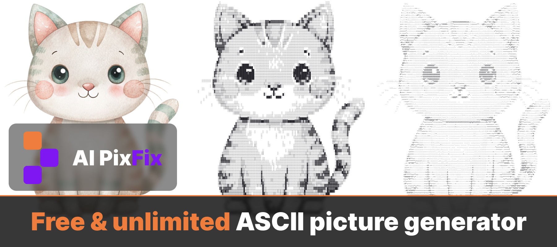
Converting an image to ASCII art is not a one-knob operation. A monospace character cell is roughly twice as tall as it is wide, which means a square photo turns into a grid that is half as many rows as columns. Detail is controlled by the width — more characters across means a finer picture, but also a wider banner that may not fit on a phone when GitHub renders the README on small screens.
The other lever is the character ramp. The classic dense-to-light ramp .:-=+*#%@ renders well on most photos — it has enough steps for skin tones and shadows without looking busy. Solid block characters fill the cell completely, which makes them ideal for hard-edged logos and icons. A longer letter-based ramp gives you finer tonality for portraits at the cost of looking like a wall of text. The AI PixFix ASCII art tool ships all three so you can switch ramps in one click rather than re-uploading the picture into a different generator.
How to make ASCII art from a photo, step by step
Open the editor
Open the ASCII picture generator in your browser. PNG, JPG, WebP, AVIF and HEIC are all accepted — wider than most ASCII tools, and the photo never leaves your device.
Set the width
Drag the detail slider between 40 and 220 characters. For a README banner, 80 is a good safe width — it fits on most screens without horizontal scroll. Drop to 60 for chunky logos, raise to 120 for a high-detail portrait.
Pick a character set
Standard is a strong default. Switch to Letters for portraits when you need more tonal detail, or to Blocks for logos and icons where you want filled cells and hard edges.
Choose a background
Toggle between white and black background. Black-on-white reads cleanest on GitHub's default light theme; white-on-black matches dark themes and a terminal MOTD.
Download as text
Click Download Text to save the result as a .txt file. The PNG export is there too if you need the artwork as an image — but for a README, plain text is what you want.
Paste it into your README the right way
ASCII art needs a monospace font and preserved whitespace to read correctly. Markdown collapses runs of spaces in normal paragraphs and proportionalises the font, which is exactly the wrong thing for ASCII. The fix is a fenced code block — three backticks before and after the art, on their own lines:
```
              .:-=+*#%@@%*+=-:.
          .-+#%@@@@@@@@@@@@@@%#+-.
        :*@@@@@@@@@@@@@@@@@@@@@@@@*:
       =@@@@@@@@@@@@@@@@@@@@@@@@@@@@=
```
Do not add a language identifier after the opening backticks (no ```ascii, no ```bash) — GitHub will apply syntax highlighting and re-colour your art. Plain triple-backtick keeps the block in monospace without touching the characters. If you want a smaller banner on phones, keep the width under 80; GitHub's mobile renderer does not wrap inside a fenced block, it scrolls horizontally instead.
How free image-to-text tools compare
The simplest competitor is ascii-art-generator.org. It works, but it runs server-side and the upload form has several limits: a 5 MB cap on the source file, only JPG, PNG, BMP, GIF and JPEG accepted, a maximum dimension of 4000×4000 pixels, and a width range of 40 to 800 characters. If you took the photo on a recent iPhone you will likely hit the 5 MB wall on the original, or be forced to convert from HEIC before uploading at all. The ASCII picture generator accepts HEIC, WebP and AVIF directly, has no upload size cap because nothing is uploaded, and runs entirely on your machine.
BeautyPlus offers an ASCII filter, but it is fixed to a single character — every cell is rendered as a dot. That looks like halftone, not like ASCII art, and it cannot do a Blocks-style filled banner or a Letters-style finely-shaded portrait. On AI PixFix you pick between three ramps — Standard, Letters and Blocks — and switch between them in a click without re-uploading the photo.
Frequently asked questions
Can I paste ASCII art directly into a GitHub README?
Yes. Download the result as a .txt file or copy it, then paste it inside a fenced code block in your README.md — three backticks on a line of their own before and after the art. The fenced block locks the font to monospace and stops Markdown from collapsing the spacing, which is what makes ASCII art readable on GitHub.
What width should I pick for a README banner?
For a README that needs to look right on both desktop and phone, 80 characters is the safe ceiling — GitHub's mobile view does not wrap long lines inside a code block, it just adds a horizontal scroll bar. If you want the art to fit without scrolling on small screens, drop it to 60 or even 40 for chunky logos. The detail slider runs from 40 up to 220 characters wide if you do want a high-detail desktop version.
Which character set works best for a portrait vs a logo?
For faces and complex photos, Letters gives the finest tonal ramp — more shades of grey, more recognisable features. For logos, icons and anything with hard edges, Blocks (solid block characters) reads better because it fills cells completely. Standard is a good middle ground and the one most ASCII tools default to.
Does the ASCII picture generator keep the original colours?
The tool focuses on the cleanest text export — black-on-white or white-on-black so the result reads as code, not as an image. If you need a colour version to embed as a PNG instead of text, download the PNG output and use that.
Is the ASCII picture generator really free with no upload?
Yes. The image is decoded and converted entirely in your browser using JavaScript — nothing is sent to a server, there is no daily cap and no watermark. You can convert any number of photos and download every result.
Turn a photo into ASCII art in your browser, pick the character set that fits the picture, and paste the result into your README. Free, no upload, no size cap, no sign-up.
Make ASCII art now