May 8, 2026 · Sepia Filters
Best Sepia Filter Online: Dozens of Vintage Tones Compared
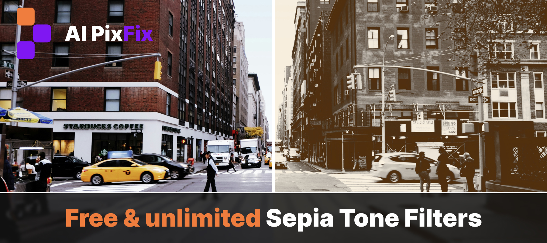
There is a reason vintage feeds keep winning on Instagram, why TikTok keeps cycling through grain-heavy aesthetics, and why every wedding photographer eventually delivers a few warm-brown frames in the gallery. A sepia tone strips a photo of its modern, perfectly calibrated digital colorimetry and replaces it with something that feels like memory rather than documentation. Skin warms up. Backgrounds quiet down. The frame stops looking like today and starts looking like a story being remembered. It is the cheapest way to take a phone photo and make it feel like an heirloom. The sepia tone filters on AI PixFix give you that look in a single click — dozens of vintage variants, calibrated so each one targets a different mood, all running entirely in your browser, all free, and with batch support so a whole shoot can take on a unified look in seconds.
Why sepia photos still feel right in 2026
Sepia is older than color photography itself. In the 19th century, photographers toned silver-based prints with a sepia bath made from cuttlefish ink — a chemical step that both preserved the print and shifted its blacks toward a warm brown. Studios from the daguerreotype era onward leaned into the look because it lasted longer on paper and felt softer to the eye than a stark monochrome.
That softness is exactly what makes the sepia look modern again. Phone cameras over-saturate. Studio lighting often pushes contrast too cleanly. A vintage filter compresses the dynamic range, lifts the shadows, and warms the highlights — every technique a contemporary editorial photographer uses to make digital images feel less clinical. The cultural cycle around vintage aesthetics is well documented in any survey of the history of photography: every decade rediscovers the textures of the one two before it. Sepia keeps coming back because nostalgia is portable and warm light is universally flattering.
The practical use cases are unglamorous and useful: family photo books, wedding albums, memorial slideshows, vintage-themed wedding invitations, branded content that wants to look heritage rather than corporate, real estate listings of historic homes, author headshots, museum-style exhibition mockups. Anywhere a frame needs to feel older than it is — a sepia tone filter is the shortest path between a phone photo and that feeling.
Dozens of sepia presets, grouped by mood
The presets are organized into five groups: Classic, Vintage, Warm, Candy, and Moody. Each combines a monochrome base with a different mix of warmth, contrast, grain, vignette and split toning between shadows and highlights. The differences are subtle in isolation but obvious in comparison.
Balanced warm brown with mid contrast. Shadow tint #704214 layered over cream highlights. The neutral starting point — a clean, recognizable sepia look without any extra atmosphere or aging cues.
Deeper, richer brown with stronger contrast and a touch of grain. Reads as an actual aged print rather than a modern digital filter. Best for family albums, scanned-photo styling, and anything that needs to feel genuinely old.
Lifted blacks (blacks +0.22) with reduced contrast and a softer cream highlight wash. Mimics a sun-faded print left in a window for years. Quiet, low-key, ideal for editorial layouts where the photo is supporting the text rather than leading.
Cool blue-black shadow tint (#1a3040) split against a warm amber highlight. Recreates the cross-toned look of 19th-century wet collodion plates. Strong character — works on portraits and architectural subjects, less on flat snapshots.
High contrast (0.55), reduced exposure, a near-black shadow tint and a desaturated highlight. The dense, slightly metallic feel of a tintype — the cheapest 19th-century portrait format and a current favorite for moody social-media edits.
Bright golden highlights (#ffd080) over a warm brown shadow. Less brown, more honey. Flattering on indoor portraits with practical light sources — lamps, candles, sunset windows.
Slight exposure boost with a saturated yellow-gold highlight. Less of an aging filter, more a warmth filter — turns midday digital photos into something that reads as late-afternoon natural light.
Heavy contrast, dropped exposure, a strong vignette, and a very dark shadow tint. The most dramatic preset in the set. Useful for low-light portraits or stylized brand imagery — anything where atmosphere matters more than fidelity.
Nine more presets — Rich Sepia, Victorian, Copper, Candy, Peach, Creamy, Blush, Tobacco, and Matte Sepia — round out the set. The free sepia filter online renders every preset live on the actual photo, at full resolution, so picking the right one is a matter of clicking through and seeing.
How to apply a sepia tone filter to your photo
Upload your photos
Drop up to 10 JPG, PNG, or WebP files into the upload zone — or click to browse. Photos load directly into the browser; nothing is sent to a server at any point in the process.
Pick a sepia tone preset
Browse the toolbar at the top of the editor. Presets are grouped by character: Classic, Vintage, Warm, Candy, Moody. Click any thumbnail to apply it to the live preview.
Adjust the intensity
The intensity slider runs from 0% (original color) to 100% (full sepia tone). Anything in between is a real crossfade between the two — useful when you want vintage warmth without committing to full monochrome.
Save
Click Save. Each photo exports at full original resolution — JPG at 0.95 quality for JPG sources, PNG for PNG and WebP sources (to preserve transparency). No watermark, no archive, no quality loss.
Intensity slider — partial sepia and why it matters
Most online sepia filters are a binary switch: applied or not. The intensity slider changes that. At 0% the photo is untouched. At 100% the full sepia tone filter is applied — channel mix, tone curve, split toning, vignette and grain all at their preset values. Every value in between is a real linear blend of the two.
The most useful range, in practice, is between 40% and 75%. The image keeps recognizable skin and clothing colors but picks up a warm, faded cast — the look of a photo printed on slightly aged paper rather than one chemically toned from the start. For editorial and lifestyle work this often reads better than full sepia, because the viewer registers the modern subject and the vintage atmosphere at the same time.
Batch a whole set in one go — without an account
Most online photo editors with a sepia preset — Picsart, ScreenSnap and similar hosted tools — work one image at a time, on a server, often behind a sign-up wall and a subscription tier for higher resolution or unlimited use. AI PixFix takes a different path. Up to 10 photos in a single session. One click applies the same sepia preset to every photo in the batch at once, at original resolution. No account. No payment. No upload — the entire pipeline runs locally.
When one photo in the batch needs a different treatment — a different mood, a different light source, a frame that simply reads better with more contrast — click the lock icon on its thumbnail. That photo breaks out of the batch and keeps its own preset and intensity independently. The rest stay in sync. This is the simplest workflow when a wedding gallery, a family album or a content calendar needs a uniform vintage look with a few one-off edits.
The AI PixFix editor exports each image as a separate file in a single Save pass — no ZIP archive, no watermark, full original dimensions preserved.
Frequently asked questions
What is the best sepia filter for old-photo nostalgia?
Antique and Victorian are the closest matches to the look of a 19th-century print. Antique adds depth in the shadows with a warm brown shadow tint and a touch of grain; Victorian layers a vignette over a similar tone, mimicking the dark frame edges typical of old albumen and cabinet-card prints. For a more dramatic, low-light mood, Dark Sepia drops exposure and pushes contrast for a heavier, almost candle-lit feel.
What is the difference between Classic Sepia and Antique?
Both convert the image to monochrome and apply warm-brown split toning. Classic Sepia is balanced and even — a neutral starting point with mid contrast and no grain. Antique pushes the contrast curve harder, deepens the shadow tint toward a richer brown, and adds a small amount of grain to suggest age and physical texture. Use Classic for a clean vintage look; Antique when you want the photo to feel genuinely old.
Can I control how strong the sepia tone is?
Yes. The intensity slider runs from 0% (the fully original color photo) to 100% (the full sepia tone effect). Anywhere in between crossfades the two. For modern portraits, 50–70% often produces a faded, vintage-leaning look while keeping recognizable color in the skin; 80–100% reads as a fully toned monochrome print.
Are my photos uploaded to a server?
No. The entire pixel pipeline — channel mix, tone curve, split toning, vignette, grain — runs on your own device using the browser Canvas API. Your photos never leave your machine, nothing is stored, and there is no upload step. Close the tab and the session is gone.
Can I apply different sepia filters to different photos in one batch?
Yes. By default every photo in the batch follows the same global preset and intensity. Click the lock icon on any thumbnail to break that photo out of the batch — it then keeps its own preset and intensity independently of the rest. The other photos stay in sync.
Dozens of vintage sepia presets — Classic, Antique, Faded, Wet Plate, Tintype, Amber, Copper, Golden Hour, Dark Sepia and more — with an intensity slider, batch up to ten photos, and per-photo independence. Free, no account, nothing uploaded.
Open the editor